Dashboards
A dashboard is a collection of widgets arranged on one or more slides. Widgets pull live data from the cubes and data tables in the same project, so they always reflect the current state of the model. Dashboards are where you present and explore results — not where you enter data.
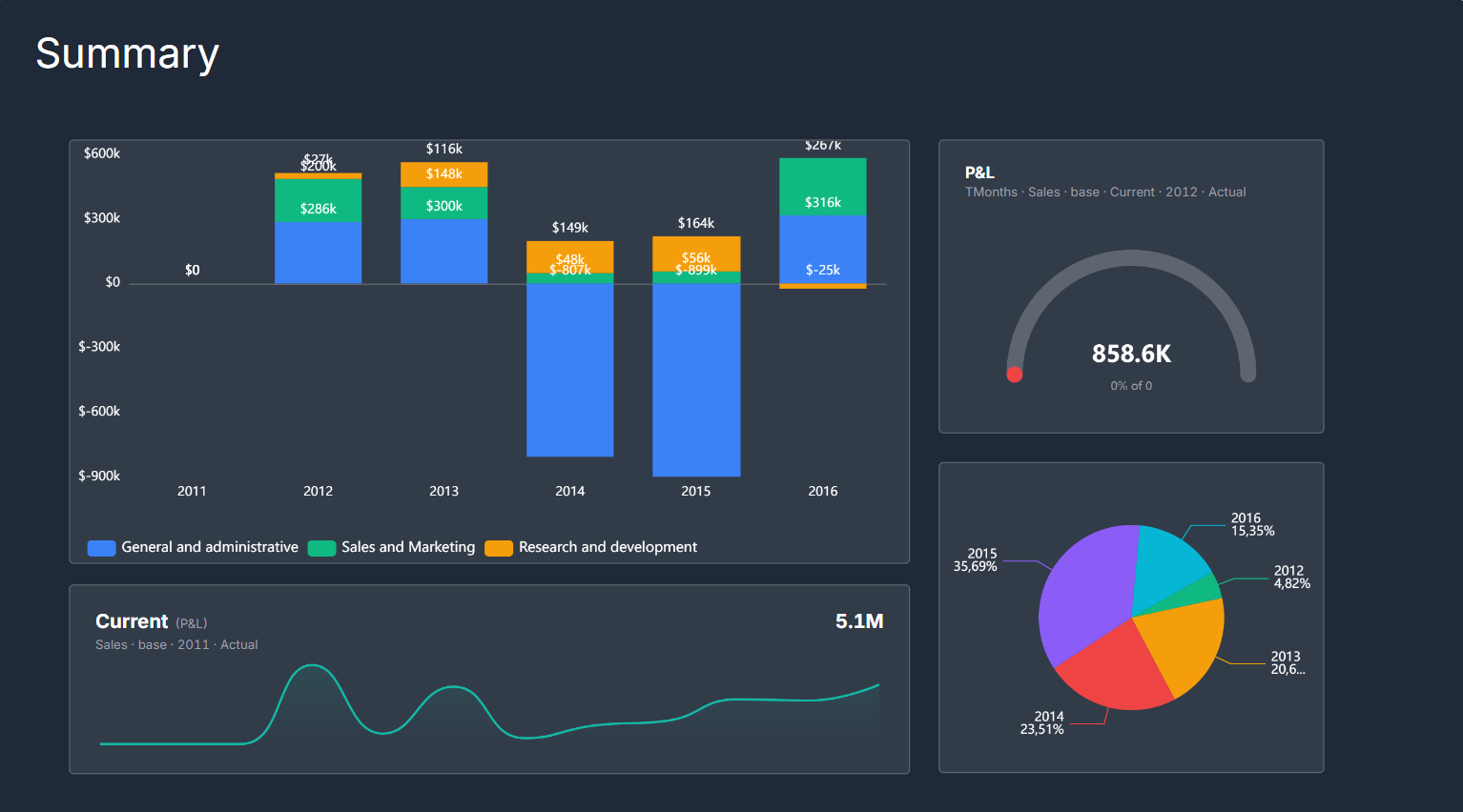
A dashboard slide: chart, scorecard, and ranking widgets arranged over a shared cube.
Widget types
Chart widgets visualize cube data as bar, line, area, pie, donut, waterfall, scatter, heatmap, or combo charts. You choose which dimension goes on the category axis (x-axis), which dimension defines the series (legend), and use filters on the remaining dimensions: one item pins the chart to that slice, several items aggregate it (summed, or averaged / weighted / opening / closing / blank per each item's aggregation rule) — and any number of unplotted dimensions can be aggregated this way in the same chart, e.g. four employees across every category. Turn on Small multiples to render one variation of the chart per item of a dimension — a grid of mini-charts for at-a-glance comparison across the set. When a chart is selected, a switch control (⇄) on the chart swaps its series and category dimensions in one click, and you can drag one of the chart's dimensions onto another to exchange the two — quick ways to re-pivot the view without reopening the settings panel.
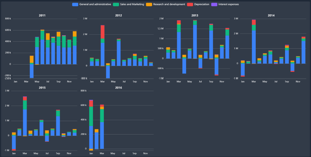
Small multiples — one variation of the same chart per item of a dimension (here a stacked-bar chart per year), for at-a-glance comparison across the whole set.
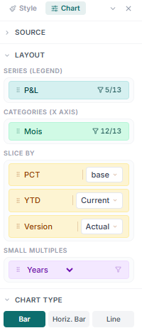
Chart settings: pick the series (legend) and category (x-axis) dimensions, slice the remaining dimensions, choose the chart type and stacking, and toggle Small multiples — plus colors, axes, legend, data labels, and reference lines.
Pivot widgets display a cube as a cross-tabulation grid — the same structure as the cube editor but embedded in the dashboard, with a collapsible hierarchy if the cube uses a hierarchical dimension.
Ranking widgets show a Top-N leaderboard: the highest (or lowest) N items of a chosen dimension, ranked by a specific measure from a cube or a data table. They are useful for "top 10 products by revenue" or "bottom 5 regions by margin".
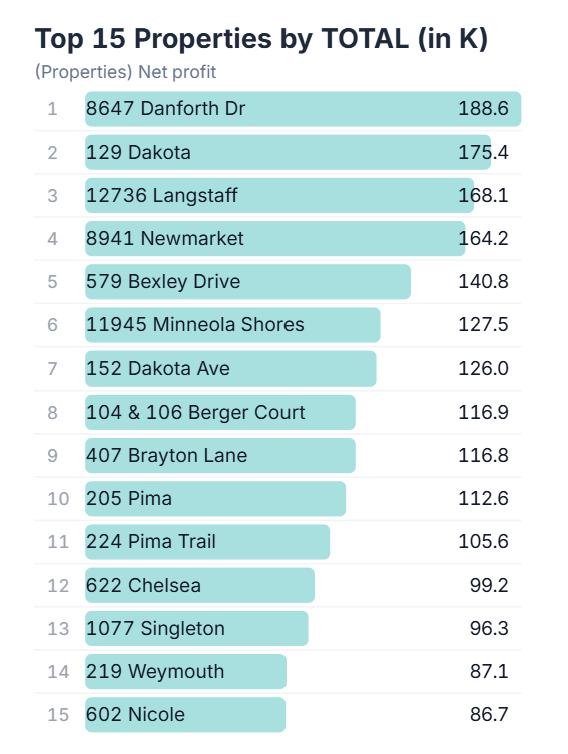
A ranking widget on a dashboard — the top 15 properties ranked by their net-profit total, each shown with its rank, label, bar, and value.
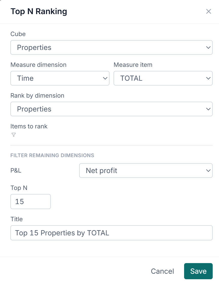
The Top N Ranking dialog: pick the cube, the measure (a dimension + item — here Time / TOTAL), the dimension to rank, how many items to show (Top N), optional filters for the remaining dimensions, and a title.
Scorecard widgets display a single KPI value, compact enough for a summary slide. Four variants: a KPI number, which can carry a target (read from another slice of the same cube — Budget instead of Actual, say) and then shows the variance and a progress bar; a gauge, the same actual-vs-target reading as a semi-circular meter against a cube value or a fixed number; a sparkline, the KPI number with a mini trend line along a time dimension; and multi-KPI, a tile grid of up to six KPIs, each drawn from its own cube.
Variance widgets highlight the difference between two items — typically Actual vs. Budget or current vs. prior year — and call out the magnitude and direction of the gap. Switched to Price / volume / mix, the same widget draws a waterfall that splits a revenue or margin variance into price, volume, mix and new/lost products — see Price, volume and mix.
Comparison tables build their columns by hand instead of from one dimension: you pick the row dimension, then add a value column per slice you want side by side — each pinned to its own cube and items — plus Δ and Δ% columns comparing any two of them. Reach for it when the comparison you want isn't the items of a single dimension, such as one measure drawn from three different cubes.
Cube flow widgets draw the model rather than its numbers: the project's cubes as boxes, with an arrow wherever a cube reference makes one read another. Narrow it to a chosen set of cubes, or leave it on the whole project as a lineage diagram on a summary slide.
Widgets over a data table
The widgets above read cubes. Four more read a data table — the row-and-column grid that holds records a cube cannot — and are the reason a table is worth keeping in a project even when its values never reach a cube.
Data table widgets list the table's rows: choose the columns and their order, group rows to get subtotals, set a default sort, and optionally append a grand total. Data table pivot cross-tabulates the same source rather than listing it.
Gantt and Board widgets read a table of tasks. A Gantt needs a label column and start and end dates, and will additionally group tasks into lanes (by phase, say), color the bars by a status column, draw dependency arrows, and mark today. A Board turns one column's values into lanes and each row into a card you drag between them — moving a card writes the new status back to the table.
Asking the assistant for a project plan, roadmap, or task tracker builds all of this in one step: a Tasks table with the right columns and a two-page dashboard holding the timeline and the board.
Pages and navigation
A dashboard can have multiple pages (slides). Top-level widgets sit on the main slide; pages are separate views navigated by tabs or a nav bar. Pages share the same project data, so a nav selection on one page can drive which items are visible on charts across the dashboard.
Dimension selections
Each chart or grid widget has a set of dimension selections — one item pinned per page-axis dimension. These narrow the data slice the widget displays. Changing a selection on a chart is non-destructive: the underlying cube data is unchanged; only the displayed slice moves.
A selection pins one item. To show several items of an unplotted dimension added together, filter the dimension to those items instead: the chart aggregates them by each item's aggregation rule (a summed rate stays wrong, so rates are averaged or weighted as the item declares) and shows an N items badge. Several unplotted dimensions can be aggregated in the same chart; the member combinations multiply (three instruments × two rounds = six slices behind every point) and a chart is refused past 1 024 of them. Two things to plan a deck around:
- Aggregation is per chart and per dimension. Every chart that should show a total has to filter every attribute-like dimension to all of its items, every time; the one you forget silently shows a single slice.
- A page dimension with no selection and no filter falls back to its first item. The chart badges the fallback in amber and a ranking lists the slice in its subtitle, but the number itself looks like a total, and nothing in it says two of your five items are missing.
Rankings, KPIs, and pivots pin single items only; they cannot aggregate a page dimension at all. A dashboard that keeps needing "all of" a dimension is a sign the model wants a total item on that dimension — see Choosing a shape you can still chart.
Scenario switching
If a cube on the dashboard has a scenario dimension, it is bound to the dashboard's nav bar automatically. Selecting a scenario there — Base, Upside, Downside — switches every widget on the deck to that scenario at once, so charts, scorecards, pivots, and variance widgets all move together. The selection is deck-wide by design: the whole dashboard stays on one scenario rather than mixing them across slides.